Independent knowledge base software guide Evidence-led Updated 2026

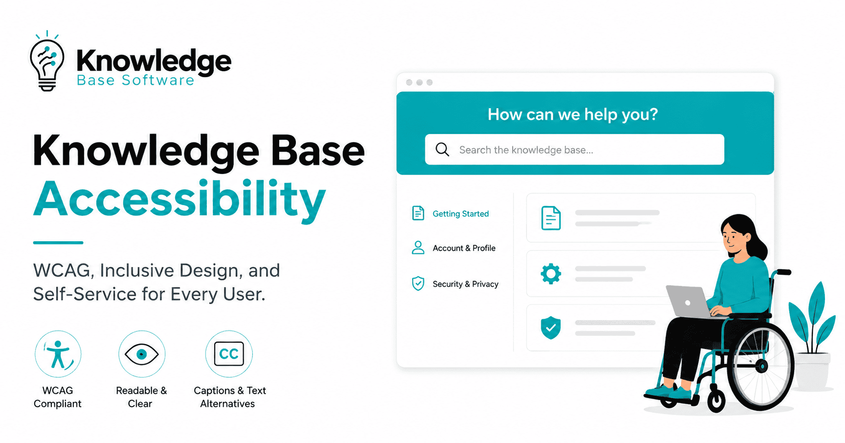
Knowledge Base Accessibility: WCAG 2.2 Guide + Original Lab
Original laboratory audit — rerun July 29, 2026: We inspected six live knowledge-base templates against 14 repeatable structural accessibility checks, then reviewed focusable elements, target-size candidates, and narrow-viewport overflow proxies. All six templates passed the structural checks. That result is useful evidence, but it is not a WCAG conformance claim: true keyboard traversal, 200% browser zoom, and assistive-technology testing still require human verification.
Knowledge base accessibility means that people can find, navigate, understand, and act on support information regardless of disability, input method, screen size, or assistive technology. It covers more than color contrast and image alt text. Search, headings, focus order, status messages, tables, code samples, forms, error recovery, and the help content itself all affect whether a user can solve a problem.
This guide translates WCAG 2.2 into practical checks for documentation and help centers. It also publishes the method and results of our own six-template laboratory audit, including its limits, so readers can separate automated evidence from manual testing.
What knowledge base accessibility includes
The Web Content Accessibility Guidelines (WCAG) 2.2 organize accessibility around four principles: content must be perceivable, operable, understandable, and robust. The success criteria are testable statements, but passing a scanner is not the same as conforming to WCAG. Many criteria require inspection, keyboard use, zoom, and assistive-technology judgment.
- Perceivable: text, images, video, diagrams, and interface states have usable alternatives and sufficient presentation.
- Operable: search, navigation, disclosures, copy buttons, feedback controls, and forms work without a mouse.
- Understandable: headings, labels, instructions, errors, and article structure are predictable and clear.
- Robust: semantic HTML and accessible names expose reliable information to browsers and assistive technologies.
For a knowledge base, accessibility also has an information-quality dimension. An accessible button cannot compensate for an article that omits prerequisites, relies on a screenshot without equivalent text, or sends the reader through an ambiguous procedure.
Our original six-template accessibility laboratory
Fresh run — July 29, 2026: We inspected six live page types on Knowledge Base Software at a 1265 × 720 CSS-pixel viewport: the homepage, the nonprofit comparison, this long guide, the FAQ page, the contact page, and a search-results page. The WordPress administrator toolbar was excluded from the page-level checks.
The goal was bounded: verify a repeatable structural baseline and identify where manual testing should concentrate. This is not a WCAG conformance audit, a screen-reader test, or evidence that every state and viewport is accessible.
Method: 14 structural checks
- declared document language, exactly one page-level H1, and no skipped level in the extracted main-content heading outline;
- main and navigation landmarks plus a skip link;
- accessible names for form controls, links, and buttons;
- alt attributes on images, unique element IDs, and titles for any iframes;
- header cells in data tables and no positive
tabindexvalues.
We also measured ordinary document-level horizontal overflow and counted visible links, buttons, fields, and disclosure controls whose rendered width or height was below 24 CSS pixels. Those are review candidates, not confirmed failures: WCAG 2.2 criterion 2.5.8 includes inline-target, spacing, essential, user-agent, and equivalent alternatives.
Results
| Template | Structural checks | Normal horizontal overflow | Small-target review candidates | Observed priority |
|---|---|---|---|---|
| Homepage | 14/14 passed | None detected | 24 | Menu, search, cards, and visible focus |
| Comparison article | 14/14 passed | None detected | 17 | Table navigation, inline links, and image reflow |
| Long guide | 14/14 passed | None detected | 14 | Heading navigation and long-page focus |
| FAQ page | 14/14 passed | None detected | 55 | Disclosure keyboard behavior and announced state |
| Contact page | 14/14 passed | None detected | 11 | One form with five controls in main content; test labels and error recovery |
| Search results | 14/14 passed | None detected | 209 | Repeated result links, metadata links, and touch spacing |
Original contact-form error test
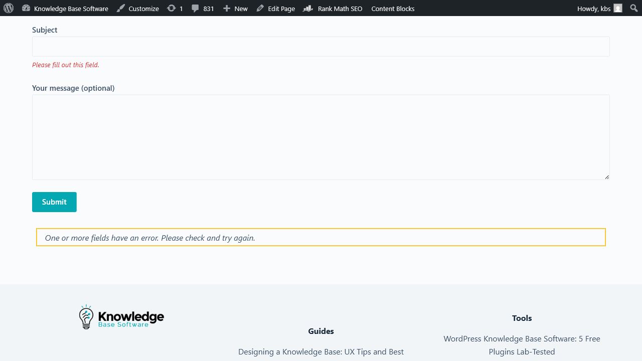
The previous laboratory record said the contact page contained no form. That statement is no longer true. In the current page, main content contains one contact form with fields for name, email, subject, and an optional message, plus a Submit control. The first three fields expose aria-required="true" and are wrapped by visible labels.
We activated Submit with all fields empty, so no message was sent. The form entered an invalid state, marked name, email, and subject with aria-invalid="true", created three “Please fill out this field” messages, and connected each field to its message with aria-describedby. The summary said “One or more fields have an error. Please check and try again.” Focus remained on Submit, and the summary container still reported aria-hidden="true" in the inspected DOM. That last combination is a manual screen-reader review item; the field-level descriptions are present, but this test does not establish how every assistive technology announces the overall result.
Interpretation
All six templates exposed the structural signals measured by this script, and none showed document-level horizontal overflow at the tested viewport. The search-results and FAQ templates produced the largest sets of target-size candidates because they repeat many short links or controls. Manual review should start there, then cover contact-form announcements, table navigation, focus visibility, zoom, and reflow.
Counts can change whenever navigation, content, plugins, or styles change. Keep the method and sample URLs fixed when comparing runs, and record the browser, viewport, date, and exclusions with every result.
Limits of this laboratory audit
We did not complete a real keyboard traversal with physical focus verification, an actual browser 200% zoom test, or a session with NVDA, JAWS, VoiceOver, or another screen reader. The browser automation surface allowed structural inspection and accessibility-tree review but did not provide trustworthy evidence for those interactions. We therefore make no claim that these pages conform to WCAG 2.2 at any level.
This distinction matters. A page can have valid landmarks and still trap keyboard focus. A disclosure can have an accessible name but fail to announce its expanded state. Text can reflow at one viewport and overlap at 200% zoom. Automated checks are a baseline and regression tool, not a substitute for manual accessibility evaluation.
Knowledge base accessibility checklist
1. Page language, title, and landmarks
- Declare the primary language in the HTML document.
- Give every page a unique title that names the task or subject.
- Use one main landmark and label multiple navigation regions when their purposes differ.
- Provide a visible-on-focus skip link that moves focus to the main content.
- Keep the article, related content, and site-wide navigation distinguishable.
2. Headings and article structure
Use headings to describe the information hierarchy, not to create a visual size. The page title should normally be the H1; major sections should be H2; subsections should be H3. A screen-reader user may navigate by headings, so vague labels such as “Overview” repeated across the page are less useful than task-specific headings.
- Put the direct answer or outcome near the beginning.
- State prerequisites before the procedure.
- Use ordered lists for steps and unordered lists for collections.
- Keep warnings next to the action they constrain.
- Describe expected results and recovery paths.
3. Keyboard operation and visible focus
Every interactive feature must work through a keyboard interface. Test in the rendered site, not only the editor. The WAI-ARIA Authoring Practices keyboard guidance explains the difference between DOM focus and the visual focus indicator, and why a predictable focus order matters.
- Start at the browser address bar and press Tab through the page.
- Confirm the skip link appears and moves focus correctly.
- Open and close menus, accordions, dialogs, and search suggestions using documented keys.
- Check that focus never disappears behind sticky headers or overlays.
- Confirm focus returns to a logical control after a dialog closes.
- Verify that custom widgets follow an established keyboard pattern.
Do not add positive tabindex values to repair a confusing DOM order. Fix the source order so keyboard and visual sequences agree.
4. Search and dynamic results
Search is often the primary path into a help center. Its input needs a persistent accessible name, not placeholder text alone. Suggestions must be keyboard operable, and changes such as “12 results found” should be exposed without unexpectedly moving focus. Empty results need a clear message and recovery options.
- Label the query field and submit control.
- Expose suggestion count and selected option state.
- Keep result titles descriptive outside their card context.
- Avoid several adjacent links with the same accessible name.
- Make spelling correction and filters understandable and reversible.
- Preserve focus and announce asynchronous updates appropriately.
5. Images, screenshots, diagrams, and video
A screenshot’s alt text should communicate its purpose, not inventory every pixel. If the image contains steps, settings, values, or an error message needed to complete the task, provide that information in nearby text. Decorative images should have empty alt text. Complex charts need a concise alternative plus the underlying data or a longer description.
- Do not put essential instructions only inside an image.
- Crop screenshots to the relevant region while preserving orientation.
- Use callouts that remain distinguishable without color alone.
- Provide captions and transcripts for prerecorded media as required.
- Update screenshots when the interface changes; stale visuals create usability barriers.
6. Links, buttons, and target size
Use links for navigation and buttons for actions. Names should make sense when encountered out of context: “Download the CSV template” is more useful than repeated “Click here” links. Avoid opening new windows without a user-understandable reason and warning.
WCAG 2.2 success criterion 2.5.8 sets a 24-by-24 CSS-pixel minimum target or sufficient spacing at Level AA, with defined exceptions. The W3C’s official explanation of Target Size (Minimum) includes exceptions for inline targets, user-agent-controlled targets, equivalent controls, essential presentations, and sufficient spacing. That is why a scanner should report review candidates rather than label every short inline link a failure.
7. Color, contrast, zoom, and reflow
- Measure text and non-text contrast in every state, including hover, focus, disabled, selected, and error states.
- Do not use color as the only way to identify warnings, status, syntax, or required fields.
- At 200% browser zoom, verify that text remains readable and controls do not overlap.
- At narrow widths, confirm content reflows without two-dimensional scrolling except where an exception applies, such as a genuinely two-dimensional data table.
- Test sticky headers, tables of contents, cookie notices, and chat widgets because fixed layers often obscure content or focus.
8. Tables, code, and technical content
Use a data table only for relationships that require rows and columns. Mark header cells correctly and provide a caption when it helps identify the table. On small screens, choose a responsive treatment that does not destroy those relationships. Code blocks should preserve characters, support text selection, and have a language or purpose label where useful. A copy button needs an accessible name and an announced success state.
9. Forms, feedback, and error recovery
- Associate every field with a visible label.
- Identify required fields in text and programmatically.
- Describe input format before submission when possible.
- Connect error text to the affected field and summarize errors at the top for long forms.
- Move or manage focus intentionally after submission.
- Make “Was this helpful?” controls understandable, operable, and non-coercive.
- Do not require a drag gesture when a simpler single-pointer alternative is possible.
10. ARIA and custom components
Prefer native HTML controls. When a custom widget is necessary, implement its accessible name, role, value, state, focus behavior, and keyboard interaction as a coherent pattern. The WAI-ARIA Authoring Practices Guide provides patterns and examples, but a copied role without the expected behavior can make the interface less accessible.
Manual test protocol for a help center
| Pass | Representative tasks | Evidence to record |
|---|---|---|
| Keyboard only | Search, filter, open an article, use table of contents, expand FAQ, send feedback | Focus order, visible focus, keys used, traps, obscured controls |
| 200% zoom | Repeat navigation and article reading at browser zoom | Overlap, clipping, lost labels, unusable sticky elements |
| Reflow/narrow viewport | Read prose, lists, tables, code, and images without unnecessary two-axis scrolling | Viewport, component, overflow direction, exception if applicable |
| Screen reader | Navigate landmarks/headings, use search suggestions, read status and errors | Browser, assistive technology/version, spoken name/role/state, task result |
| Visual inspection | Contrast, color independence, focus indicator, text spacing | Measured values and screenshots of each state |
| Content comprehension | Complete a procedure using text alternatives and error recovery | Missing prerequisite, ambiguous step, image-only information, recovery outcome |
Test a representative template set rather than one convenient article: homepage, search and empty search, category, standard article, long article, table-heavy article, FAQ/disclosure, restricted content, form, error state, and mobile navigation. Then sample content types and risk levels within each template.
How to prioritize accessibility fixes
- Blockers: tasks that cannot be completed with keyboard or assistive technology, inaccessible authentication, traps, and missing critical alternatives.
- High-frequency barriers: search, global navigation, article template, feedback, and repeated component defects.
- High-risk content: security, billing, health, legal, account recovery, and destructive actions.
- Content defects: missing prerequisites, unclear headings, image-only steps, and ambiguous link names.
- Enhancements: improvements beyond the minimum that reduce effort and increase comprehension.
Fix shared templates and components before repairing the same defect article by article. Add regression tests for rules that automation can measure, and keep manual scripts for behavior and meaning that automation cannot decide.
Frequently asked questions
Is an automated accessibility score enough?
No. Automated tools can find important classes of defects, but they cannot reliably judge all keyboard behavior, reading order, text alternatives, instructions, content meaning, or assistive-technology usability. Use them as one layer in a combined test process.
Does passing 14 structural checks mean a page is WCAG compliant?
No. Our 14 checks cover a useful structural subset. They do not cover every WCAG success criterion or every state of the interface, and our laboratory did not complete real keyboard, 200% zoom, or screen-reader sessions.
Do all links need to be at least 24 by 24 CSS pixels?
WCAG 2.2 criterion 2.5.8 defines a 24-by-24 minimum or sufficient spacing at Level AA, but it also defines exceptions. Inline links inside sentences are one explicit exception. Review context and spacing before classifying a measured candidate as a failure.
Which knowledge base template should be tested first?
Start with the shared article template and search journey because they affect the most users and pages. Then test navigation, category pages, FAQ/disclosure components, forms, restricted content, error states, and high-risk procedures.
Bottom line
Knowledge base accessibility is a continuous quality practice spanning templates, interactive components, and the instructions themselves. Establish a structural baseline, but verify real tasks with keyboard, zoom, reflow, and assistive technology. Our six-template lab found no failure in its 14 structural checks and no ordinary horizontal overflow; it also identified search-result metadata, FAQ behavior, zoom/reflow, and the contact-page expectation as the most useful next manual checks.
Laboratory transparency: Audit date: July 29, 2026. Sample: six live templates on Knowledge Base Software. Scope: 14 structural checks, extracted focusable order, normal-overflow check, target-size candidates, and narrow-layout proxies. Not completed: trustworthy physical keyboard traversal, actual 200% browser zoom, or a screen-reader session. Result: scoped evidence only, not a WCAG 2.2 conformance statement.