Independent knowledge base software guide Evidence-led Updated 2026

Designing a Knowledge Base: UX Tips and Best Practices
Knowledge base UX is the complete path from a question to a trustworthy answer and a successful next action. Layout is part of that path, but so are search, labels, information architecture, accessibility, writing, feedback, escalation, and maintenance. A polished help center can still fail if its search uses internal jargon, its article hides the action, or its mobile layout forces horizontal scrolling.
Quick answer
The strongest knowledge base layout puts a specific answer near the top, makes the primary action obvious, uses a logical heading outline, keeps controls large enough to operate, and reflows without sideways scrolling. Pair that article pattern with prominent search, task-based categories, useful result snippets, a helpful no-results state, related next steps, and an accessible route to human support. Test representative pages at narrow widths and with real tasks; do not infer usability from appearance or an automated score alone.
In this guide
- What knowledge base UX includes
- Original baseline-versus-revised layout test
- A task-first article layout
- Homepage and navigation patterns
- Knowledge base search UX
- Mobile and accessibility requirements
- Content design and visual hierarchy
- Feedback, escalation, and trust
- A repeatable improvement workflow
- Launch checklist and metrics
- Frequently asked questions
What does knowledge base UX mean?
Knowledge base user experience is not a theme or a collection of cards. It is whether someone can recognize where to start, express a problem in their own words, select the right result, understand the answer, complete the task, and recover when the answer does not fit. It also includes whether the experience works with a keyboard, assistive technology, zoom, a small screen, a slow connection, and unfamiliar product terminology.
That makes UX a shared responsibility. Product teams influence the workflow and interface labels. Support teams know recurring failure modes. Content designers shape the explanation. Developers and designers control semantics, reflow, focus, and interaction. Knowledge owners keep the answer current. Analytics teams identify gaps without confusing page views with successful resolution.
Start with the user’s task and evidence, then choose the structure. Our guides to knowledge base information architecture and designing a search experience cover those two connected layers in depth.
Original experiment: four checks on two article prototypes
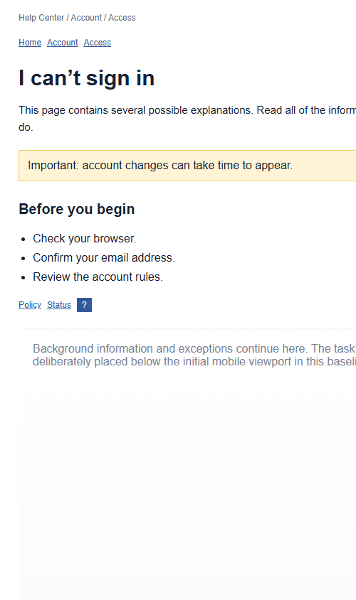
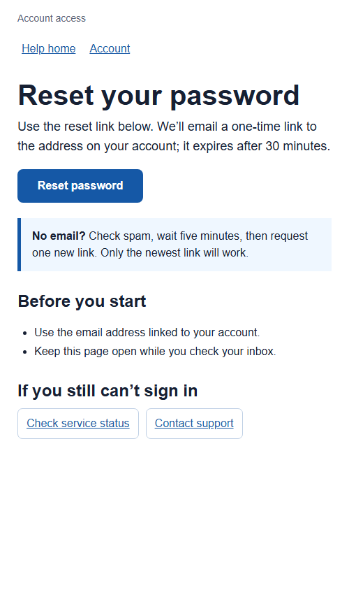
To make the recommendations testable, we built two local versions of the same password-help scenario and rendered both in headless Google Chrome on July 29, 2026. The baseline deliberately used patterns that often create friction: a fixed-width article, a skipped heading level, undersized controls, background information before the primary action, and vague opening copy. The revised version used a responsive container, answer-first copy, sequential headings, larger controls, and an early primary action.
How we tested
Both prototypes ran the same embedded JavaScript checks in the same browser engine. Chrome reported an actual inner viewport of 500 × 692 CSS pixels. We recorded four values:
- Viewport overflow: failure when the document’s scroll width exceeded its client width.
- Heading structure: one H1 and no downward jump greater than one heading level.
- Tap target sizing: the rendered rectangles of every visible link and button, with a simplified minimum of 24 × 24 CSS pixels.
- First-action position: the top coordinate of the primary reset action and whether it appeared inside the initial viewport.
The 24-pixel rule was selected from the WCAG 2.2 Target Size (Minimum) success criterion. Our script only compared element rectangles; it did not evaluate the criterion’s spacing and exception logic. The heading rule was a deterministic outline check, informed by the need for descriptive, organized headings in WCAG 2.2 Headings and Labels.
Results
| Check | Baseline | Revised |
|---|---|---|
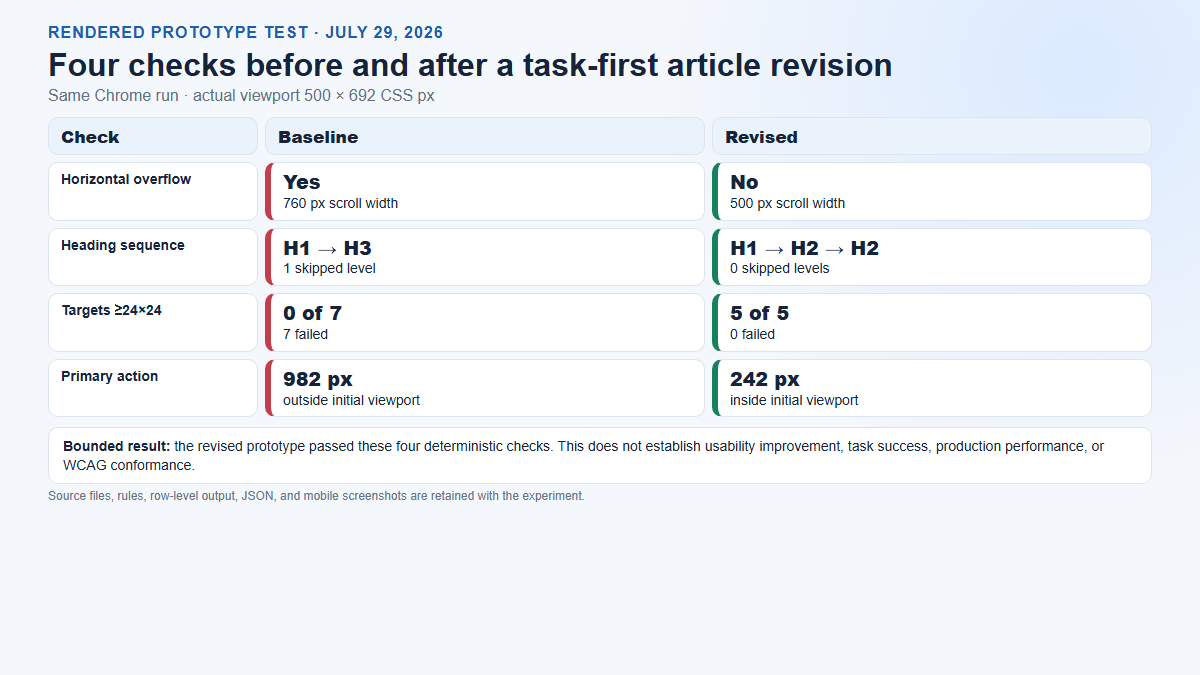
| Horizontal overflow | Yes: 760 px scroll width in a 500 px viewport | No: 500 px scroll width in a 500 px viewport |
| Heading structure | H1 → H3; one skipped level; failed | H1 → H2 → H2; no skipped levels; passed |
| Targets at least 24 × 24 CSS px | 0 of 7 passed; 7 failed | 5 of 5 passed; 0 failed |
| First primary action | Top at 982 px; outside initial viewport | Top at 242 px; inside initial viewport |
Limitations
This was a deterministic prototype comparison, not a study with users and not an audit of the live site. It did not measure comprehension, task completion, search relevance, keyboard focus, screen-reader output, color contrast, zoom, localization, loading performance, or Core Web Vitals. Several variables changed together, so the experiment cannot attribute an effect to one change. Passing four checks does not establish WCAG conformance. The first-action coordinate is descriptive: placing every action “above the fold” is not a universal rule, and a complex task may require essential context first.
The defensible conclusion is narrow: the revised prototype removed the specific overflow, outline, target-size, and initial-action-position failures defined before the run. A real product still needs task testing with representative users and a fuller accessibility review.
A task-first knowledge base article layout
A repeatable article pattern lowers the effort required to decide whether an answer applies. Not every section belongs in every article, but users should encounter information in a predictable order:
- Task title: use the action or problem in the user’s language: “Reset your password,” not “Credential Management Overview.”
- Scope: identify the product, plan, role, version, campus, or operating system when it changes the answer.
- Direct answer: state the normal solution or decision in the opening paragraph.
- Primary action: expose the next safe action near the answer when the user can take it immediately.
- Before you start: list prerequisites, permissions, expected time, and irreversible consequences.
- Steps: one action per numbered step, matching current interface labels.
- Verification: explain what success looks like and how to confirm it.
- Troubleshooting: cover the few common branches that materially change the path.
- Escalation: explain when to stop and contact support, what information to include, and where urgent issues go.
- Freshness and ownership: show a meaningful reviewed date and maintain an accountable owner behind the page.
Place extensive background, policy rationale, and edge cases after the main task or link them separately. The user who already understands the context should not have to read an essay before acting. At the same time, do not move a warning below an irreversible action merely to make the button appear earlier.
A content type can modify the pattern. A troubleshooting article may lead with symptoms and diagnostic branches; a reference page may prioritize a definition table; a policy explainer may lead with applicability and effective date. Our knowledge base templates and examples provide reusable structures without forcing every answer into one mold.
Design the homepage for routes, not decoration
Most people arrive with a task, not a desire to browse the organization. The homepage should make the main retrieval routes obvious: search, a small set of task-based categories, common or urgent tasks, service status, and a support route. A campaign carousel, stock illustration, or long welcome message should not push those paths away from the initial view.
Useful homepage elements
- A clearly labelled search field with a concrete example, not placeholder-only instructions.
- Categories named for user goals—Getting Started, Billing, Account Access, Integrations, Troubleshooting—rather than internal teams.
- A short list of high-demand tasks based on evidence, reviewed seasonally.
- Known issues or service status when an incident changes the correct answer.
- An accessible contact or escalation route that remains available after a failed search.
- Consistent header, breadcrumb, and search access on article pages so the homepage is not a one-way entrance.
Keep category depth proportional to the collection. A small knowledge base rarely needs three levels of folders. A large one may need facets, audience or product selectors, and landing pages that explain boundaries. Card sorting and tree testing with representative labels can reveal whether people understand the structure before a visual redesign consumes engineering time.
Knowledge base search UX: test the whole response
A large search box does not guarantee useful search. Evaluate what happens before typing, while typing, after submission, and after failure. The input needs an accessible name and clear scope. Suggestions should be keyboard operable and distinguishable from recent queries. Results need task-specific titles, enough context to choose, freshness or version information when relevant, and filters that reduce ambiguity without becoming a second taxonomy.
Build a fixed query test set
Collect 20–50 phrases from tickets, chats, support calls, community posts, and no-result logs. Preserve real wording, including misspellings, abbreviations, error messages, old feature names, and outcome phrases such as “invoice for last month” or “invite someone without admin.” For every release, record whether the right answer appears, its position, whether the snippet distinguishes it, and whether the article completes the task.
Do not tune only to an exact title. Add controlled synonyms between internal and user language, but avoid making every word synonymous with every feature. When the query is ambiguous, show meaningful distinctions such as product, role, version, or symptom. When there are no results, preserve the query, offer spelling or broader suggestions, surface relevant categories, and provide a support route. A blank “0 results” page makes the user carry the entire recovery burden.
For AI or semantic answers, test citations, permission boundaries, outdated sources, conflicting articles, and refusal or escalation behavior. Our guide to AI answer quality testing provides a more complete evaluation pattern.
Design for reflow, input, and assistive technology
Responsive design is more than shrinking desktop cards. At narrow widths, preserve reading order, keep the article title and answer visible, allow long URLs and code to wrap or scroll inside their own container, and prevent global horizontal scrolling. The WCAG 2.2 Reflow criterion defines a more demanding conformance condition than our 500-pixel prototype check; use the actual criterion for accessibility evaluation.
- Keyboard: every control must be reachable, visibly focused, and operable in a logical order. Avoid focus traps in search suggestions, image viewers, and feedback dialogs.
- Headings and landmarks: use semantic structure that describes sections. Do not select heading levels for visual size.
- Links and buttons: use descriptive names. A link navigates; a button performs an action. Repeated “click here” links hide purpose.
- Images: write alt text for information the image contributes; use empty alt text for truly decorative images. Do not put essential instructions only in a screenshot.
- Tables: use header cells and keep the relationship understandable on small screens. Consider a list pattern when a comparison cannot reflow.
- Video and audio: provide accurate captions or transcripts and describe meaningful visual-only information.
- Zoom and text spacing: test enlarged text rather than assuming a responsive breakpoint covers it.
- Errors and status: identify the problem in text, associate it with the relevant field, and announce dynamic changes appropriately.
Automated tools can find missing names, some contrast failures, malformed structure, and other detectable patterns. They cannot decide whether a heading is useful, alt text communicates the right information, the search result solves the need, or the workflow makes sense. Combine automated checks, keyboard review, screen-reader review, zoom and reflow testing, and moderated tasks with disabled users. See our focused knowledge base accessibility guide for a broader test plan.
Use content design to create visual hierarchy
Clear writing reduces layout pressure. A page does not need a grid of colorful callouts when the title, answer, steps, warnings, and next action have distinct purposes. The GOV.UK content design guidance emphasizes starting from user needs and using the words people use. That principle fits support content: mirror the interface and the user’s goal, define necessary technical terms, and remove introductions that delay the answer.
Practical hierarchy rules
- Use one descriptive page title supplied by the theme or post template, then begin article sections at H2.
- Keep paragraphs focused on one idea and move prerequisites into a short list.
- Use numbered lists for sequences and bullets for unordered requirements or options.
- Reserve warning styling for risk, not emphasis. Too many alerts make none of them salient.
- Label examples, notes, and exceptions by purpose rather than color alone.
- Keep lines readable and avoid full-width text on large screens; code, logs, and wide tables need their own overflow treatment.
- Show interface text exactly as users see it, but do not bold every noun.
- Link the next likely task where it becomes relevant instead of appending an indiscriminate “related articles” cloud.
A consistent template improves recognition, but consistency is a means rather than the goal. If a two-sentence answer genuinely resolves the task, do not inflate it to satisfy a template. If a destructive operation requires context and verification, do not compress it into a quick tip.
Design feedback and escalation as recovery paths
A “Was this helpful?” control is useful only when the response leads somewhere. Offer a short reason such as outdated, unclear, did not match, steps failed, or access problem. Capture the article version and relevant context without collecting unnecessary personal data. Route urgent safety, security, billing, or account-access problems to the correct service rather than a generic content backlog.
Preserve context when escalating. If the user opens a case after reading an article, attach the article URL, search query, product area, and attempted step where consent and privacy rules allow. Do not force the user to repeat a failed journey. Human support should remain a visible safety net, especially where judgment, empathy, identity verification, or account-specific data is required.
Trust also depends on freshness. A “last updated” date is weak if a cosmetic edit resets it. Prefer “reviewed on” with an accountable owner and meaningful review event. Our guides to knowledge base content lifecycle and knowledge base governance explain how to keep UX from degrading after launch.
A repeatable workflow for improving knowledge base UX
- Choose a bounded journey. Start with one high-volume task, such as resetting a password, downloading an invoice, or connecting an integration.
- Gather evidence. Collect real queries, tickets, recordings with consent, article feedback, product labels, and failure points.
- Write success criteria before redesigning. Examples: no horizontal overflow; primary task apparent within ten seconds; all steps completed without support; no critical accessibility issues.
- Map the path. Include search or navigation, result choice, article comprehension, product action, verification, and escalation.
- Build the smallest representative prototype. Use realistic copy, warnings, controls, long titles, images, and error states.
- Run deterministic checks. Test structure, overflow, controls, links, images, performance, and obvious accessibility defects at defined viewports.
- Test tasks with representative people. Observe what they search, where they hesitate, whether they choose the right result, and whether they complete the action.
- Revise and rerun the same test. Keep the query set, tasks, devices, and scoring stable enough to compare.
- Release gradually. Monitor failed searches, exits to support, article feedback, and product errors. Keep a rollback path.
- Assign ownership. Tie the article to product changes, incidents, policy reviews, and a regular content-health process.
Record the raw output and the limitations, not only the success story. A screenshot shows what rendered at one moment; a CSV or JSON record preserves the values; a method note allows another reviewer to challenge the rule. That combination makes an “original test” more useful than a decorative before-and-after image.
Knowledge base UX launch checklist
Findability
- Priority user-language queries return a relevant, distinguishable result.
- Search suggestions and filters work by keyboard and do not hide the typed query.
- Task-based categories remain understandable without knowing the organization chart.
- No-results pages suggest recovery and support rather than blame.
Article layout
- The title identifies the task, problem, or decision.
- The answer and safe next action appear before optional background.
- Prerequisites, steps, verification, exceptions, and escalation are easy to distinguish.
- Heading levels describe a coherent outline and are not used as styling shortcuts.
- Related links reflect likely next steps and have descriptive labels.
Accessibility and resilience
- Representative pages reflow at required zoom and viewport conditions without loss of content or functionality.
- Controls are operable by keyboard, have visible focus, clear names, and adequate target size or spacing.
- Images, tables, forms, code, video, alerts, and dynamic search states have appropriate accessible treatment.
- The task still works when an image fails, a title is unusually long, content is translated, or the user has reduced motion enabled.
- Automated results are followed by manual and assistive-technology review.
Governance and measurement
- Every article has an owner, review trigger, and retirement or redirect path.
- Feedback includes a reason and reaches someone able to act.
- Analytics connect search, article, action, and support signals without overstating causation.
- High-risk journeys have faster review and a clear human escalation route.
- The team retests fixed queries and critical tasks after material product or taxonomy changes.
What should you measure?
Use a balanced set of findability, task, quality, and maintenance measures. Search success can include relevant-result selection, query reformulation, zero results, and time to a confident choice. Article measures can include task completion, error rate, time on task, reason-coded feedback, and escalation. Content-health measures can include overdue reviews, broken links, duplicate answers, orphan pages, and coverage of priority intents.
Interpret behavior in context. Short time on page may mean a crisp answer or an immediate abandonment. A support contact after an article may mean failure or the correct escalation for an account-specific problem. Estimated ticket deflection is not the same as verified resolution. Our guide to knowledge base analytics for product teams provides a fuller measurement model.
Frequently asked questions
What makes a good knowledge base UX?
A good experience helps the intended audience find the right answer, understand it, complete the task, and recover when it does not apply. It combines user-language search and navigation, task-first articles, accessible interaction, current content, and a clear support path.
Where should search appear?
Make search prominent on the homepage and consistently available on result and article pages. Placement alone is not enough: test its accessible name, suggestions, relevance, snippets, filters, no-results state, and behavior with real queries.
Should the answer always be above the fold?
Put the direct answer and safe next step early, but do not hide essential prerequisites or warnings to satisfy an arbitrary fold. Device size, zoom, browser UI, language, and content length change the fold. Test whether users can quickly identify what to do and whether they have the context to do it safely.
How wide should a knowledge base article be?
There is no single ideal pixel width. Use a readable line length for prose, a responsive maximum width, and dedicated treatment for code and tables. Confirm that content reflows under the accessibility conditions you support rather than choosing a desktop width and assuming it will scale.
Are 24-pixel tap targets always sufficient?
No universal shortcut replaces the full criterion and real use. Our prototype used a simplified 24 × 24 rectangle check based on WCAG 2.2 Target Size (Minimum), but WCAG includes exceptions and spacing logic. Many design systems choose larger targets for comfort and touch reliability. Evaluate size, spacing, context, input methods, and your users.
Can an automated accessibility tool validate knowledge base UX?
No. Automated tools are valuable for detectable rules but cannot establish task success, meaningful structure, appropriate alt text, search relevance, or overall WCAG conformance. Use them as one layer alongside manual review, assistive-technology testing, and tasks with representative users.
How often should the UX be reviewed?
Retest critical journeys after navigation, search, theme, product, or policy changes. Review search gaps and feedback continuously, and schedule broader task and accessibility testing at a cadence proportional to traffic and risk. Stable visual styling does not mean the experience remains accurate.
Bottom line: treat the knowledge base as a support product. Define a task, preserve the evidence, test the whole path, publish the limitations, and rerun the same checks after revision. The goal is not a prettier library; it is a faster, clearer, safer route from question to action.