Independent knowledge base software guide Evidence-led Updated 2026


Knowledge Base Search Experience: Accessible UX, Autocomplete, and Original Audit
A strong knowledge base search experience does more than return matching article titles. It gives people a consistent place to search, preserves their query and filters, supports keyboard and assistive-technology users, explains empty states, and makes the next useful action obvious. Search relevance still matters, but the interface around the ranking system determines whether a person can formulate a query, inspect suggestions, refine the results, and recover when the system finds nothing.
This guide combines implementation guidance from the World Wide Web Consortium (W3C) with an original structural audit of the public search surface on Knowledge Base Software. The audit found useful foundations—a native no-results form, programmatic names, one H1 per state, and a working skip link—but also found no public search entry point in three important page states, a 396-link results surface, hidden no-results guidance on small screens, and one keyboard-activation observation that now requires manual cross-browser confirmation.
Audit disclosure: The structural run was completed on July 28, 2026 against four unauthenticated public URLs. It inspected returned HTML and public CSS. It was not a screen-reader test, a rendered zoom test, or a WCAG conformance audit. A later browser automation observation tested only Enter, Space, and pointer activation on the no-results submit button; its result is reported separately and requires manual confirmation.
Quick answer: what makes a knowledge base search experience effective?
An effective knowledge base search experience should meet six practical requirements:
- Persistent entry: people can start or refine a search from the home page, an article, the results page, and the no-results page.
- Native fallback: a labeled search field and submit button work without relying on a pointer or an autocomplete script.
- Predictable autocomplete: when suggestions exist, the input, popup, options, states, and keyboard behavior follow a documented pattern.
- Programmatic feedback: dynamic result counts, loading completion, and no-results states are exposed without moving focus.
- Bounded results: result cards are scannable, avoid duplicate focus stops, and use pagination or another accessible way to limit the initial result set.
- Responsive recovery: instructions, filters, results, and support options remain available at narrow widths and high zoom.
Table of contents
- What is a knowledge base search experience?
- Original search UX audit
- Create a persistent search entry point
- Start with an accessible native search form
- Implement autocomplete as a real combobox
- Announce dynamic status messages
- Design filters and facets around user decisions
- Reduce search-result focus density
- Build a recoverable no-results state
- Test mobile layout, text resizing, and reflow
- Measure search UX without inventing benchmarks
- Implementation and QA checklist
- Official sources
- FAQs
What is a knowledge base search experience?
A knowledge base search experience is the complete path from deciding to search through opening a useful answer or choosing another support route. It includes the search entry point, query field, suggestions, spelling or synonym support, filters, result cards, result counts, empty states, URL behavior, loading feedback, keyboard interaction, responsive layout, and analytics.
The ranking engine is only one layer. A relevant result is not useful if the search control is absent from the page, the suggestion popup cannot be operated from a keyboard, a result card repeats the same destination several times in the Tab order, or no-results guidance disappears on mobile.
| Layer | User question | Design responsibility |
|---|---|---|
| Entry | Where can I search? | Persistent, consistently named control |
| Query | What words should I use? | Clear label, editing support, optional suggestions |
| Feedback | Did the system respond? | Loading, result count, active filters, and no-results status |
| Results | Which answer should I open? | Distinct titles, useful snippets, restrained metadata, one primary destination |
| Refinement | How do I narrow this set? | Understandable filters, visible applied state, reversible actions |
| Recovery | What do I do if nothing works? | Query-editing guidance, related paths, and an honest support route |
Original audit: the current public search surface
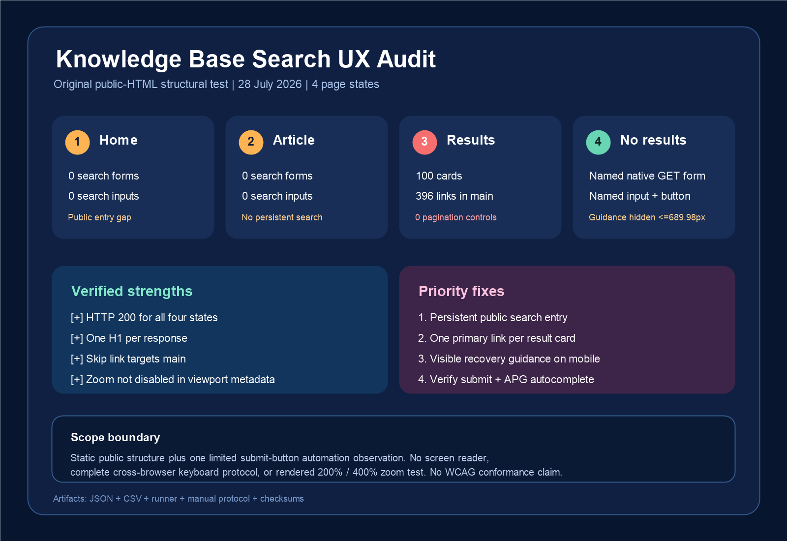
We ran a reproducible structural audit against four public page states on July 28, 2026. The requests were unauthenticated, so WordPress administration controls were excluded. For each state, we recorded the final URL, HTTP status, UTF-8 response size, SHA-256 fingerprint, H1 count, search controls, result cards, links, pagination, and search-related ARIA markup. We also inspected the public CSS rule attached to the no-results guidance.
The test used these states:
- Home:
https://knowledge-base.software/ - This article:
/guides/designing-a-search-experience/ - Positive results:
/?s=knowledge+base - No results:
/?s=zzzz-no-result-20260728
Measured results
| State | Measured public structure | Interpretation |
|---|---|---|
| Home | HTTP 200; one H1; zero search forms; zero search inputs; skip link targets #main | No server-rendered public search entry point |
| Article | HTTP 200; one H1; zero search forms; zero search inputs; skip link targets #main | A reader cannot start a search from the article’s public HTML |
| Positive results | HTTP 200; 100 article cards; 396 links in main; 108 distinct destinations; zero search forms; zero pagination controls | Query refinement is absent and the potential focus path is unusually dense |
| No results | HTTP 200; one native GET search form; one named search input; one named button; zero static live regions or status roles | The fallback form has useful native foundations, but the dynamic behavior needs further testing |
What the current implementation already does well
- All four public responses returned HTTP 200.
- Each response contained one H1.
- Each response included a “Skip to content” link targeting
#main. - The viewport declaration allowed scaling up to five times rather than disabling browser zoom.
- The no-results state used a native GET form,
input type="search", a programmatic input name, and a programmatically named submit button.
These are useful foundations and should be preserved. The objective is not to replace native controls with a custom widget. It is to make the same reliable search path available on every important page state, then add autocomplete only if it can be implemented and tested correctly.
Priority findings
1. Search was absent from three important states
The public HTML for the home page, this article, and the positive-results page contained no search form or search input. The positive-results page therefore showed results but gave the visitor no direct field for refining the query. This is a discoverability and workflow gap rather than proof of a particular WCAG failure.
2. One results page exposed 396 links
The query knowledge base produced 100 article cards and 396 links inside main. Only 108 destinations were distinct, which means 288 link positions repeated a destination already present in the same region. The first inspected card used four links: category, article title, linked image pointing to the same article, and author.
This is a measured source-order risk indicator, not a manual Tab count. Hidden states and focus styling still need an interactive test. Nevertheless, result cards should normally expose one clear primary article destination and only essential secondary actions. Linked images that duplicate the title destination and repeated author links add work without adding a new outcome.
3. No-results guidance was hidden on small screens
The explanation “Sorry, but nothing matched your search terms. Please try again with some different keywords.” used the class ct-hidden-sm. The public stylesheet applied display:none !important to that class at viewport widths up to 689.98 pixels. The search form remained, but the recovery guidance disappeared at the width where concise instructions are especially valuable.
4. The static response did not establish an autocomplete relationship
The no-results form placed aria-haspopup="listbox" on the form, while the static response contained no search combobox, controlled listbox, options, aria-expanded, or search-specific aria-controls relationship. JavaScript-injected markup was not exercised in the structural run. If the form does not provide suggestions, the popup declaration should be removed. If it does, the input and popup should implement a complete, tested combobox interaction.
Supplemental keyboard-activation observation
A later browser automation run examined the no-results submit button. The input value was changed to knowledge base, the element named “Search button” was focused and confirmed as the active element, and an actual Enter keypress was sent. No navigation occurred after five seconds. Space was then sent while the button remained active; again, no navigation occurred after five seconds. A pointer click on the same button navigated successfully to /?s=knowledge+base&post_type=any.
Interpretation: this was an observed keyboard-activation failure in one browser automation run. The browser name and version and the event trace were not captured. It must be repeated manually in a fresh logged-out session and in a second browser before diagnosing the cause or making a cross-browser or WCAG conclusion.
What this audit did not test
- No screen reader was used.
- The full Tab, Shift+Tab, arrow-key, Escape, focus-visible, and focus-return protocol was not completed.
- JavaScript autocomplete suggestions and announcements were not exercised.
- The interface was not rendered at 200% or 400% zoom.
- The test does not establish WCAG conformance or non-conformance.
- The reported HTML hashes identify the responses inspected at that time; live pages can change.
Package SHA-256: 7328e0a884fc1d90556573d3773ac7ced6bb16c760df3c2b104a304af967f396
Create a persistent search entry point
People should not have to return to a special page to search. Add the same public search landmark to the home page, article template, positive-results template, and no-results template. Keep its name and placement consistent enough that a visitor can form a reliable expectation.
A persistent search entry point should:
- be available to logged-out visitors, not only through the WordPress admin toolbar;
- have an accessible name such as “Search the knowledge base”;
- remain reachable by keyboard at narrow widths;
- submit to a normal results URL when JavaScript is unavailable;
- retain the current query on the results page;
- avoid opening an unrelated navigation drawer before search becomes available;
- use the same destination and query parameter across templates.
Search does not need to dominate every article, but it should not disappear after a person starts reading or after the system returns results. A compact field in the public header plus a larger field on the home and results templates can share the same underlying form.
Start with an accessible native search form
The safest baseline is a native GET form. Standard HTML controls already expose useful keyboard and accessibility behavior when used correctly. The W3C’s explanation of WCAG 2.2 Name, Role, Value emphasizes that interface controls need programmatically determinable names and roles and that their states and values must be available to user agents.
<form role="search" method="get" action="/">
  <label for="kb-search">Search the knowledge base</label>
  <input
    id="kb-search"
    name="s"
    type="search"
    value=""
  >
  <button type="submit">Search</button>
</form>
A visible label is ideal because it identifies the field for everyone. A properly associated visually hidden label can also provide a programmatic name when the design has a nearby visible heading that makes the purpose clear. Do not rely only on placeholder text: it disappears as a person types and may be easy to mistake for an entered value.
Keep the server-side form working before adding live suggestions. Test these basic actions first:
- Enter from the input submits the query.
- Enter and Space on the submit button activate it.
- The results H1 includes or is associated with the query.
- The results page keeps the query in the field.
- Browser Back and Forward restore the expected state.
- A no-results request returns a useful page instead of a dead end.
Implement autocomplete as a real combobox—or do not add it
Autocomplete can help people discover the words used in your documentation, but it creates a composite widget with state and keyboard requirements. The W3C WAI-ARIA Authoring Practices Guide combobox pattern describes an input associated with a popup such as a listbox. It documents the required relationships and the expected behavior for Down Arrow, Up Arrow, Enter, Escape, text-editing keys, and optional shortcuts.
For an editable search combobox with list suggestions, the implementation normally needs:
- an input acting as the combobox;
- a distinct accessible name;
aria-expandedreflecting whether the popup is open;aria-controlsreferencing the popup;aria-autocomplete="list"when the values are filtered suggestions;- a popup with an appropriate role such as
listbox; - suggestions with
role="option"and stable IDs; aria-activedescendantwhen DOM focus remains on the input while the active option changes;- visual styling that matches the programmatic active or selected state.
<label for="kb-search">Search the knowledge base</label>
<input
  id="kb-search"
  name="s"
  type="search"
  role="combobox"
  aria-autocomplete="list"
  aria-expanded="false"
  aria-controls="kb-suggestions"
  aria-activedescendant=""
>

<ul id="kb-suggestions" role="listbox" hidden>
  <li id="suggestion-1" role="option">Reset your password</li>
</ul>
This markup is only a skeleton. ARIA does not add keyboard behavior, filtering, focus management, or selection by itself. Do not publish these attributes until the script updates them correctly.
| Key | Expected search-combobox behavior |
|---|---|
| Tab | Moves to the combobox in normal page order; popup options are not separate unexpected Tab stops |
| Printable characters | Edit the text and update suggestions according to the product’s documented trigger |
| Down Arrow | Moves the active option into the popup when suggestions are available |
| Up Arrow | Moves predictably through options; placing focus on the last option is an optional pattern |
| Enter | Accepts or opens the active suggestion; without an active suggestion it submits the typed query |
| Escape | Closes the popup without unexpectedly discarding the typed query |
| Left/Right/Home/End | Continue to support normal single-line text editing |
The APG is implementation guidance, not a substitute for testing. Use the pattern as the contract, then verify the behavior in the browsers and assistive technologies your audience uses.
Announce dynamic result counts and no-results states
A full-page search request does not automatically need an ARIA live region. The browser navigates to a new document, and the page title, H1, focus management, and visible content can communicate the new state. The requirement changes when JavaScript updates suggestions, result counts, filters, or no-results content without a page navigation.
WCAG 2.2 Status Messages addresses changes that should be programmatically exposed without receiving focus. For a live search, a concise polite status region can communicate messages such as:
- “8 suggestions available.”
- “24 results for password reset.”
- “No results for printer login.”
- “Filter applied: Product is Mobile.”
<p
  id="search-status"
  role="status"
  aria-live="polite"
  aria-atomic="true"
></p>
Do not announce every keystroke, every loading frame, or a long block of result text. Update the status after the meaningful result state settles, avoid stale messages after rapid typing, and keep focus in the search field unless the person chooses to move it.
Design filters and facets around user decisions
Filters are valuable when the unfiltered result set contains genuinely different products, audiences, content types, versions, or languages. Do not add a facet merely because the metadata exists. Every control adds a choice, a state to preserve, an analytics dimension, and another path to test.
Use controls that match the selection model:
- Checkboxes when a person can select multiple values in one group.
- Radio buttons when values are mutually exclusive.
- A native select when a single compact choice is more important than seeing every option at once.
- Buttons or links only when their state and action are clear and implemented consistently.
<fieldset>
  <legend>Filter by product</legend>
  <label>
    <input type="checkbox" name="product" value="mobile">
    Mobile <span aria-hidden="true">(12)</span>
  </label>
  <label>
    <input type="checkbox" name="product" value="desktop">
    Desktop <span aria-hidden="true">(9)</span>
  </label>
</fieldset>
Result counts can help people avoid empty paths, but the accessible label should remain stable as counts change. Applied filters should be visible near the results heading, removable individually, and reversible through “Clear all.” Store the query and filter state in the URL so results can be bookmarked, shared, restored through Back and Forward, and audited.
On narrow screens, a filter drawer can be useful, but it must have a descriptive trigger, controlled expanded state, predictable focus movement, a visible way to close it, and an applied-filter summary outside the drawer. Do not make the results invisible until a person discovers an unlabeled filter icon.
Reduce search-result focus density
A result card should help a person answer two questions quickly: “Is this about my problem?” and “What happens if I open it?” The article title is normally the primary link. Add a short snippet and only the metadata that materially distinguishes the result, such as product, version, content type, or updated date.
For the audited 100-card result state, four recurring links per card created most of the 396-link path. A better pattern is:
- one linked article title;
- an image that is decorative or part of the same link rather than a second duplicate destination;
- plain-text author and category metadata unless those links are important search actions;
- a snippet that contains useful query context, not a generic introduction;
- an accessible pagination control or another bounded loading model.
Do not set a universal page-size benchmark based on this one audit. Choose an initial result count by testing real queries and devices, but keep it bounded. Pagination provides clear location and a restorable URL. “Load more” can also work when the control is named, the appended content is announced appropriately, focus remains predictable, and the browser history does not discard the user’s position.
Search quality belongs in the same measurement plan. Use a frozen query set and relevance labels when comparing retrieval systems; our separate vector search knowledge base lab explains how to compare keyword, vector, hybrid, and reranked retrieval without confusing interface usability with ranking relevance.
Build a recoverable no-results state
“No results” is not the end of the task. It is evidence that the current query and the indexed vocabulary did not connect. Keep the query editable and explain what the person can do next.
A useful no-results state should include:
- the original query in the heading or nearby text;
- a search field containing the query;
- a visible explanation at every viewport width;
- two or three concrete recovery actions, such as removing a product filter, using fewer words, or trying the product’s preferred term;
- related categories or curated starting points only when they are relevant;
- a path to human support when self-service cannot solve the problem;
- analytics that record the normalized query and applied filters without collecting unnecessary personal information.
Example: No results for “printer login.” Try “sign in,” remove the Product filter, or browse Account access. Still stuck? Contact support.
Avoid pretending that “popular articles” are relevant to every failed query. Label fallback content honestly. If an AI answer is offered, show the sources and the uncertainty or escalation behavior instead of masking the retrieval failure.
Test mobile layout, text resizing, and reflow
The W3C explanation of WCAG 2.2 Reflow describes the objective of reading and operating content without page-level two-dimensional scrolling at the specified narrow dimensions, apart from content that genuinely requires a two-dimensional layout. It also explains the relationship with text resizing and common 200% and 400% zoom tests.
A search field, no-results explanation, result card, applied-filter summary, and pagination control are not made exempt merely because a data table elsewhere on the page needs horizontal scrolling. Test the search task itself at:
- 200% browser zoom from a typical desktop viewport;
- the 320 CSS pixel equivalent commonly produced by 400% zoom from a 1280 CSS pixel viewport;
- a narrow mobile viewport below the site’s 690-pixel breakpoint;
- long queries, long article titles, translated strings, and large system text;
- the autocomplete popup open, filters expanded, and no-results content visible.
Check that controls do not overlap, focused elements are not obscured by sticky headers, horizontal scrolling is limited to genuine exceptions, and every recovery instruction remains visible. The static audit confirmed that zoom was not disabled in the viewport metadata, but it did not render these states; visual verification is still required.
Measure search UX without inventing universal benchmarks
Do not publish a target such as “a good search always resolves a task in two clicks” unless your own protocol and data support it. Search difficulty varies by audience, task, content set, device, permissions, and query specificity. Establish a baseline with your own frozen sample and publish the definitions.
| Measure | Definition to publish | What it can reveal |
|---|---|---|
| Search task success | Share of tested tasks where the participant reaches the predetermined correct article or outcome | End-to-end effectiveness |
| First-result success | Share of successful tasks completed from the first opened result | Ranking plus snippet clarity |
| Query reformulation | Share of sessions where the query changes before a successful or abandoned outcome | Vocabulary or relevance mismatch |
| No-result rate | No-result searches divided by eligible searches after bot and empty-query rules | Content, metadata, spelling, or filter gaps |
| Result-to-open rate | Eligible result views that lead to an article open | Result title and snippet usefulness; not proof of resolution |
| Accessibility completion | Passed tasks in a published keyboard and assistive-technology matrix | Whether the interface can be operated in the tested combinations |
| Time on task | Start and stop events defined before testing | Friction, only when interpreted with success and error data |
Separate ranking metrics from interface metrics. For example, nDCG or reciprocal rank can evaluate a frozen query set, while task success and reformulation evaluate the complete experience. A faster search response is not a better experience if the result set is irrelevant, the focus order is repetitive, or the no-results guidance is hidden.
For implementation performance tests, define the exact page, cache state, location, device, number of runs, and percentile. Our knowledge base performance benchmarking guide explains why an isolated number without a protocol is not a reusable benchmark.
Knowledge base search implementation checklist
Entry and fallback
- Public search is present on home, article, results, and no-results templates.
- The form uses GET and works without JavaScript.
- The field has a visible or properly associated programmatic label.
- Enter from the field and Enter/Space on the button submit in at least two browsers.
- The current query remains visible and editable on the results page.
Autocomplete
- Popup semantics are absent when no popup exists.
- When autocomplete exists, the input, popup, options, expanded state, control relationship, and active option are exposed correctly.
- Down Arrow, Up Arrow, Enter, Escape, and text-editing keys match the documented interaction.
- Suggestions do not become unexpected Tab stops.
- Loading, result availability, and no-suggestion states are concise and not repetitive.
Results and filters
- Each card has one primary article destination.
- Decorative or duplicate linked images do not add redundant focus stops.
- Metadata links exist only when they support a real refinement or navigation task.
- Results are bounded with accessible pagination or a tested progressive-loading pattern.
- Filters use native controls and clear group labels.
- Query and filter state are represented in the URL and restored by Back and Forward.
- Applied filters can be removed individually and cleared as a group.
Feedback and recovery
- Dynamic result counts and no-results states are programmatically exposed without moving focus.
- Full-page results have a specific document title and H1.
- No-results guidance remains visible on mobile and at high zoom.
- The query can be edited immediately.
- Related links are labeled as suggestions rather than guaranteed matches.
- A human support path is available when appropriate.
Manual QA matrix
| Environment | Test | Record |
|---|---|---|
| Chrome and Firefox, keyboard only | Tab order, visible focus, submit, popup keys, filters, pagination, Back/Forward | OS, browser version, URL, exact steps, pass/fail, evidence |
| NVDA with Firefox or Chrome | Names, roles, states, active suggestion, result count, no results | NVDA/browser versions and announced output |
| VoiceOver with Safari | Input, rotor/landmarks, suggestions, results, filters, status messages | OS/browser/VoiceOver versions and announced output |
| 200% and 400% zoom | Reflow, clipping, sticky overlap, popup visibility, mobile no-results guidance | Viewport, zoom, screenshot, overflow and focus observations |
Keep this matrix with release artifacts. A statement such as “keyboard accessible” is meaningful only when the tested environment, task, date, and result are available. For a broader help-center audit, use our knowledge base accessibility guide.
Official standards and guidance used
- W3C WAI-ARIA Authoring Practices Guide: Combobox Pattern — roles, states, popup relationships, and keyboard interaction.
- WCAG 2.2 Understanding 2.1.1 Keyboard — keyboard-operable functionality.
- WCAG 2.2 Understanding 2.4.7 Focus Visible — visible keyboard focus.
- WCAG 2.2 Understanding 1.4.10 Reflow — narrow-width and zoom-related reflow.
- WCAG 2.2 Understanding 4.1.2 Name, Role, Value — programmatic control information.
- WCAG 2.2 Understanding 4.1.3 Status Messages — programmatic exposure of important dynamic changes.
Frequently asked questions
What is the most important feature of a knowledge base search experience?
The most important foundation is a reliable, consistently available search path. A named native form that can be submitted from a keyboard is more valuable than an impressive autocomplete popup that is missing from key templates or cannot be operated predictably.
Does every knowledge base need autocomplete?
No. Autocomplete is useful when it helps users discover terminology or content, but it is optional. A fast native search form with clear results can be better than a poorly implemented custom combobox. Add suggestions only when you can maintain the state, keyboard behavior, announcements, and relevance.
Should a no-results message always use aria-live?
Not always. When submitting the form loads a new document, the new page title, H1, focus behavior, and visible message can communicate the state. When JavaScript updates results or suggestions without navigation, the relevant count or no-results message should be programmatically exposed without forcing focus to move.
What ARIA roles does search autocomplete need?
An editable autocomplete commonly uses a combobox input associated with a popup such as a listbox, with options and current expanded and active-option states. The exact implementation should follow the W3C APG pattern selected for the popup. ARIA attributes alone are not enough; the script must implement the expected behavior.
How many links should a search result card have?
There is no universal numeric rule. Start with one primary link to the article and add a secondary link only when it provides a distinct, useful action. Avoid separate title and image links to the same destination and repeated author or category links that do not help the current search task.
How should knowledge base filters work on mobile?
A compact filter drawer can work if its trigger has a clear name and expanded state, focus is managed predictably, the drawer can be closed without a pointer, and applied filters remain visible near the results. The results and no-results instructions should remain readable without opening the filter drawer.
Did this audit prove the site fails WCAG?
No. The audit recorded specific structural observations and one limited browser automation result. It did not include a complete keyboard protocol, a named screen-reader matrix, or rendered reflow testing, so it does not make a WCAG conformance determination. The artifacts separate confirmed observations from follow-up tests.
Conclusion
Designing a knowledge base search experience starts with continuity: one public, named, keyboard-operable search path across the home page, articles, results, and empty states. Build that native foundation first. Then reduce duplicate result links, keep recovery guidance visible at every breakpoint, represent filters in the URL, and add autocomplete only as a fully implemented and tested combobox.
The original audit gives this site a concrete baseline: four public states, 100 result cards, 396 links, 108 distinct destinations, a mobile-hidden no-results explanation, and one keyboard-activation observation requiring confirmation. The next responsible step is to apply the fixes, rerun the same structural package, and complete the published keyboard, screen-reader, and reflow protocol before making broader accessibility claims.